Examples 2
Some additional examples to demonstrate the use of the HYPEHD package. The test dataset is open source data from https://github.com/insightsengineering/scda.2022 website.
%%capture
%pip install --index-url https://test.pypi.org/simple/ --extra-index-url https://pypi.org/simple hypehd
Imports
from hypehd import visualization as vis
from hypehd import data_manipulation as da
import hypehd
Reading the data
# read into dataframe dm from package
my_file = hypehd.PACKAGEDIR / 'data' / 'demographic.csv'
dm=da.read("csv", my_file)
dm.head()
| Unnamed: 0 | STUDYID | USUBJID | SUBJID | SITEID | AGE | AGEU | SEX | RACE | ETHNIC | ... | DCSREAS | DTHDT | DTHCAUS | DTHCAT | LDDTHELD | LDDTHGR1 | LSTALVDT | DTHADY | ADTHAUT | study_duration_secs | |
|---|---|---|---|---|---|---|---|---|---|---|---|---|---|---|---|---|---|---|---|---|---|
| 0 | 1 | AB12345 | AB12345-CHN-3-id-128 | id-128 | CHN-3 | 32 | YEARS | M | ASIAN | HISPANIC OR LATINO | ... | DEATH | 2022-03-06 | ADVERSE EVENT | ADVERSE EVENT | 22.0 | <=30 | 2022-03-06 | 1106.0 | Yes | 63113904 |
| 1 | 2 | AB12345 | AB12345-CHN-15-id-262 | id-262 | CHN-15 | 35 | YEARS | M | BLACK OR AFRICAN AMERICAN | NOT HISPANIC OR LATINO | ... | NaN | NaN | NaN | NaN | NaN | NaN | 2022-03-17 | NaN | NaN | 63113904 |
| 2 | 3 | AB12345 | AB12345-RUS-3-id-378 | id-378 | RUS-3 | 30 | YEARS | F | ASIAN | NOT HISPANIC OR LATINO | ... | NaN | NaN | NaN | NaN | NaN | NaN | 2022-03-11 | NaN | NaN | 63113904 |
| 3 | 4 | AB12345 | AB12345-CHN-11-id-220 | id-220 | CHN-11 | 26 | YEARS | F | ASIAN | NOT HISPANIC OR LATINO | ... | NaN | NaN | NaN | NaN | NaN | NaN | 2022-03-26 | NaN | NaN | 63113904 |
| 4 | 5 | AB12345 | AB12345-CHN-7-id-267 | id-267 | CHN-7 | 40 | YEARS | M | ASIAN | NOT HISPANIC OR LATINO | ... | NaN | NaN | NaN | NaN | NaN | NaN | 2022-03-15 | NaN | NaN | 63113904 |
5 rows × 57 columns
Checking data null bias
You will need to check the bias in your data sometimes and some forms of bias checking are to be done manually but our package offers two forms of automated bias checking. To find columns with too much missing data and to check to see if the distribution of discrete data is as intended.
Here, we have checked the columns for too much missing data, in other words, columns that have too many null values. This is done using the check_bias function.
too_null_1 = da.check_bias(dm)
Columns with too many null values:
 [['TRTEDTM', 73], ['TRT01EDTM', 73], ['TRT02SDTM', 73], ['TRT02EDTM', 73], ['AP01EDTM', 73], ['AP02SDTM', 73], ['AP02EDTM', 73], ['EOSDT', 73], ['EOSDY', 73], ['DCSREAS', 280], ['DTHDT', 330], ['DTHCAUS', 330], ['DTHCAT', 330], ['LDDTHELD', 330], ['LDDTHGR1', 330], ['LSTALVDT', 73], ['DTHADY', 330], ['ADTHAUT', 343]]
Dealing with too many null values
For this you can either remove the column with too many null values which is done later in this example file, or you can impute the missing data using the handle_null function which also gives the option to remove the rows with the missing values.
Here, we have removed the row with null values in columns that had too many nulls.
# make copy of unhandled version for future use
dm_uncleaned = dm.copy()

# remove rows with null values from columns that have too many nulls
for null in too_null_1[0]:
    dm = da.handle_null(dm, null[0], impute_type="remove")
dm.head()
| Unnamed: 0 | STUDYID | USUBJID | SUBJID | SITEID | AGE | AGEU | SEX | RACE | ETHNIC | ... | DCSREAS | DTHDT | DTHCAUS | DTHCAT | LDDTHELD | LDDTHGR1 | LSTALVDT | DTHADY | ADTHAUT | study_duration_secs | |
|---|---|---|---|---|---|---|---|---|---|---|---|---|---|---|---|---|---|---|---|---|---|
| 0 | 1 | AB12345 | AB12345-CHN-3-id-128 | id-128 | CHN-3 | 32 | YEARS | M | ASIAN | HISPANIC OR LATINO | ... | DEATH | 2022-03-06 | ADVERSE EVENT | ADVERSE EVENT | 22.0 | <=30 | 2022-03-06 | 1106.0 | Yes | 63113904 |
| 5 | 6 | AB12345 | AB12345-CHN-15-id-201 | id-201 | CHN-15 | 49 | YEARS | M | ASIAN | NOT HISPANIC OR LATINO | ... | DEATH | 2022-02-22 | ADVERSE EVENT | ADVERSE EVENT | 3.0 | <=30 | 2022-02-22 | 1085.0 | Yes | 63113904 |
| 12 | 13 | AB12345 | AB12345-RUS-1-id-52 | id-52 | RUS-1 | 40 | YEARS | F | ASIAN | NOT HISPANIC OR LATINO | ... | DEATH | 2022-02-20 | DISEASE PROGRESSION | PROGRESSIVE DISEASE | 7.0 | <=30 | 2022-02-20 | 1070.0 | Yes | 63113904 |
| 16 | 17 | AB12345 | AB12345-BRA-11-id-9 | id-9 | BRA-11 | 40 | YEARS | M | ASIAN | NOT HISPANIC OR LATINO | ... | DEATH | 2022-03-20 | DISEASE PROGRESSION | PROGRESSIVE DISEASE | 36.0 | >30 | 2022-03-20 | 1091.0 | Yes | 63113904 |
| 18 | 19 | AB12345 | AB12345-CHN-15-id-245 | id-245 | CHN-15 | 34 | YEARS | F | WHITE | NOT HISPANIC OR LATINO | ... | DEATH | 2022-02-18 | DISEASE PROGRESSION | PROGRESSIVE DISEASE | 1.0 | <=30 | 2022-02-18 | 1057.0 | Yes | 63113904 |
5 rows × 57 columns
Adding categories for a numerical column
You can change unumerical values to categorical ones useing the numeric_to_categorical function. Here we have changed AGE into categories.
You can replace the previous column or create a new column for your categorical data, we have used True to indicate a new column called AGE_group.
dm = da.numeric_to_categorical(dm, 'AGE', [[30, '(,30]'], [35, '(30,35]'],
                                        [40, '(35,40]'], [45, '(40,45]'],
                                        [50, '(45,50]']], True)
dm.head()
| Unnamed: 0 | STUDYID | USUBJID | SUBJID | SITEID | AGE | AGEU | SEX | RACE | ETHNIC | ... | DTHDT | DTHCAUS | DTHCAT | LDDTHELD | LDDTHGR1 | LSTALVDT | DTHADY | ADTHAUT | study_duration_secs | AGE_group | |
|---|---|---|---|---|---|---|---|---|---|---|---|---|---|---|---|---|---|---|---|---|---|
| 0 | 1 | AB12345 | AB12345-CHN-3-id-128 | id-128 | CHN-3 | 32 | YEARS | M | ASIAN | HISPANIC OR LATINO | ... | 2022-03-06 | ADVERSE EVENT | ADVERSE EVENT | 22.0 | <=30 | 2022-03-06 | 1106.0 | Yes | 63113904 | (30,35] |
| 5 | 6 | AB12345 | AB12345-CHN-15-id-201 | id-201 | CHN-15 | 49 | YEARS | M | ASIAN | NOT HISPANIC OR LATINO | ... | 2022-02-22 | ADVERSE EVENT | ADVERSE EVENT | 3.0 | <=30 | 2022-02-22 | 1085.0 | Yes | 63113904 | (45,50] |
| 12 | 13 | AB12345 | AB12345-RUS-1-id-52 | id-52 | RUS-1 | 40 | YEARS | F | ASIAN | NOT HISPANIC OR LATINO | ... | 2022-02-20 | DISEASE PROGRESSION | PROGRESSIVE DISEASE | 7.0 | <=30 | 2022-02-20 | 1070.0 | Yes | 63113904 | (35,40] |
| 16 | 17 | AB12345 | AB12345-BRA-11-id-9 | id-9 | BRA-11 | 40 | YEARS | M | ASIAN | NOT HISPANIC OR LATINO | ... | 2022-03-20 | DISEASE PROGRESSION | PROGRESSIVE DISEASE | 36.0 | >30 | 2022-03-20 | 1091.0 | Yes | 63113904 | (35,40] |
| 18 | 19 | AB12345 | AB12345-CHN-15-id-245 | id-245 | CHN-15 | 34 | YEARS | F | WHITE | NOT HISPANIC OR LATINO | ... | 2022-02-18 | DISEASE PROGRESSION | PROGRESSIVE DISEASE | 1.0 | <=30 | 2022-02-18 | 1057.0 | Yes | 63113904 | (30,35] |
5 rows × 58 columns
Plotting the distribution of a demographic feature
You can create a pie chart to show the distribution a discrete variable using the pie function. If you want to save it, specify the path. If you use ”.” it will be saved in the same directory as your code file.
vis.pie(df = dm, col = "AGE_group",path = ".", name = "age_pie_chart")
([<matplotlib.patches.Wedge at 0x7fa3ddc85650>,
  <matplotlib.patches.Wedge at 0x7fa3ddc85ed0>,
  <matplotlib.patches.Wedge at 0x7fa3ddc9e750>,
  <matplotlib.patches.Wedge at 0x7fa3ddc9e450>,
  <matplotlib.patches.Wedge at 0x7fa3dbc2b790>],
 [Text(0.5320908144466621, 0.9627457427490853, '(35,40]'),
  Text(-1.084458100654201, 0.18425696167440575, '(,30]'),
  Text(-0.30451921808270677, -1.0570090093363902, '(30,35]'),
  Text(0.7778173500684048, -0.7778175685419846, '(40,45]'),
  Text(1.084458098497778, -0.18425697436619265, '(45,50]')],
 [Text(0.2902313533345429, 0.525134041499501, '33.9%\n19'),
  Text(-0.5915226003568368, 0.10050379727694858, '26.8%\n15'),
  Text(-0.16610139168147642, -0.57655036872894, '19.6%\n11'),
  Text(0.42426400912822076, -0.42426412829562793, '14.3%\n8'),
  Text(0.5915225991806061, -0.10050380419974143, '5.4%\n3')])

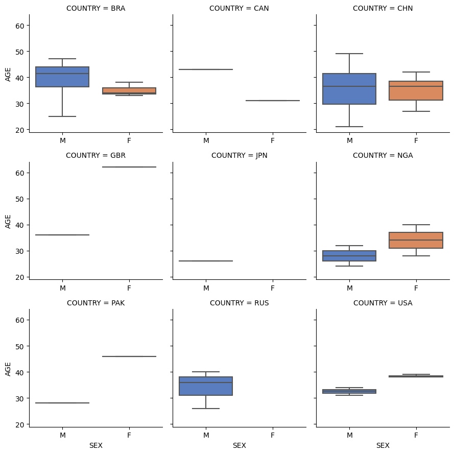
Plotting a boxplot grid
You can plot a boxplot grid of either three features (one numeric and two categorical) or of all numeric features using the boxplot_grid function.
Here we have plotted AGE by SEX and COUNTRY.
vis.boxplot_grid(dm, col1='COUNTRY', col2='SEX', col3='AGE')
/home/docs/checkouts/readthedocs.org/user_builds/hypehd/envs/latest/lib/python3.7/site-packages/seaborn/axisgrid.py:712: UserWarning: Using the boxplot function without specifying `order` is likely to produce an incorrect plot.
  warnings.warn(warning)
<seaborn.axisgrid.FacetGrid at 0x7fa3db3e6290>
Generate demographic plots
There is another function can help users exploring the distribution and description statics of both continuous and discrete variables simultaneously using demo_graph() function. Here generates plots of AGE, SEX by different treatment group.
vis.demo_graph(var=["AGE", "SEX"], input_data=dm, group='TRT01P')
([<Figure size 1500x1000 with 1 Axes>, <Figure size 1500x1000 with 1 Axes>],
 [<AxesSubplot:title={'center':'Plot and summary table for Age'}, ylabel='AGE'>,
  <AxesSubplot:title={'center':'Plot and summary table for Sex'}, ylabel='SEX'>])


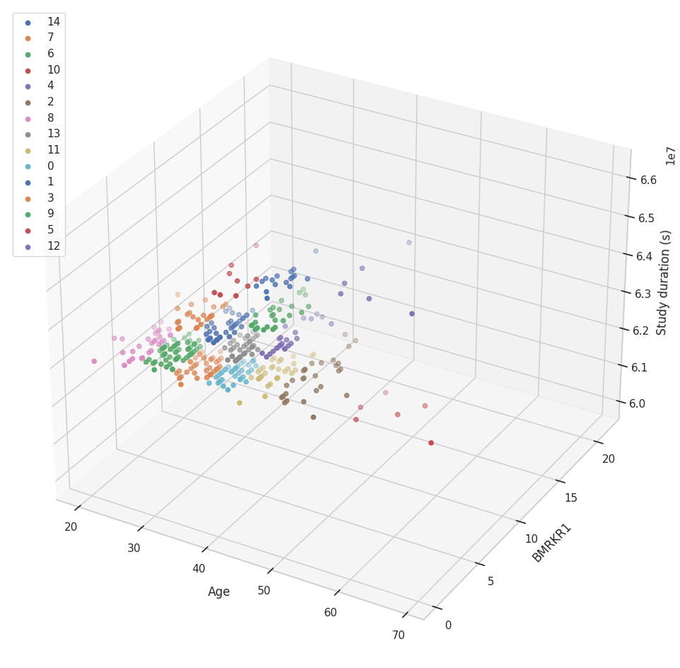
Plotting 3D clusters
You can find and plot the clusters between three numerical features using the cluster_3d function and you can choose your prefered clustering method out of the options available.
Here, we have plotted a three dimentional cluster graph of AGE, BMRKR1 and study_duration_secs using k-means clustering.
If you only want a 3D graph without the clustering, you can use the graph_3d function.
vis.cluster_3d(df=dm_uncleaned, cols=['AGE','BMRKR1','study_duration_secs'],
               lab1 = 'Age', lab3='Study duration (s)', c_type="k-means", legend=True)
(<Figure size 1200x1200 with 1 Axes>,
 <Axes3DSubplot:xlabel='Age', ylabel='BMRKR1'>)
Plotting 2D clusters
For two dimentional clustering you can use the cluster_2d function in a similar fashion to the three dimentional function.
We have plotted a two dimentional cluster graph of AGE and BMRKR1 with DBSCAN clustering.
vis.cluster_2d(df=dm_uncleaned, cols=['AGE','BMRKR1'], c_type="dbscans", min_sample=10)
(<Figure size 1200x1200 with 1 Axes>,
 <AxesSubplot:xlabel='AGE', ylabel='BMRKR1'>)

Change data type
You can change a column’s data type between String, Integer and Float types using the change_type function.
Here we have changed BMRKR1 from float to int.
dm_uncleaned = da.change_type(dm_uncleaned, 'BMRKR1', int)
Add a numeric coded column from a categorical column
The categorical_to_numeric function changes numerical data columns to categorical ones. Here we changed the SEX column in the dm_uncleaned dataset to 0 and 1 and added the values into a separate column (SEX_goup) by setting add to True, if we use False it will replace the previous values within the SEX column.
dm_uncleaned = da.categorical_to_numeric(dm_uncleaned, 'SEX', [['F', 0],['M', 1]], True)
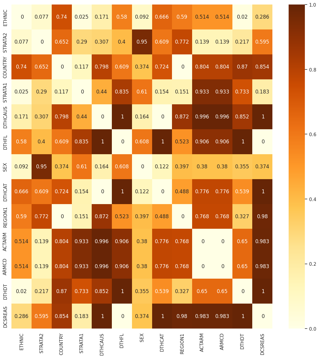
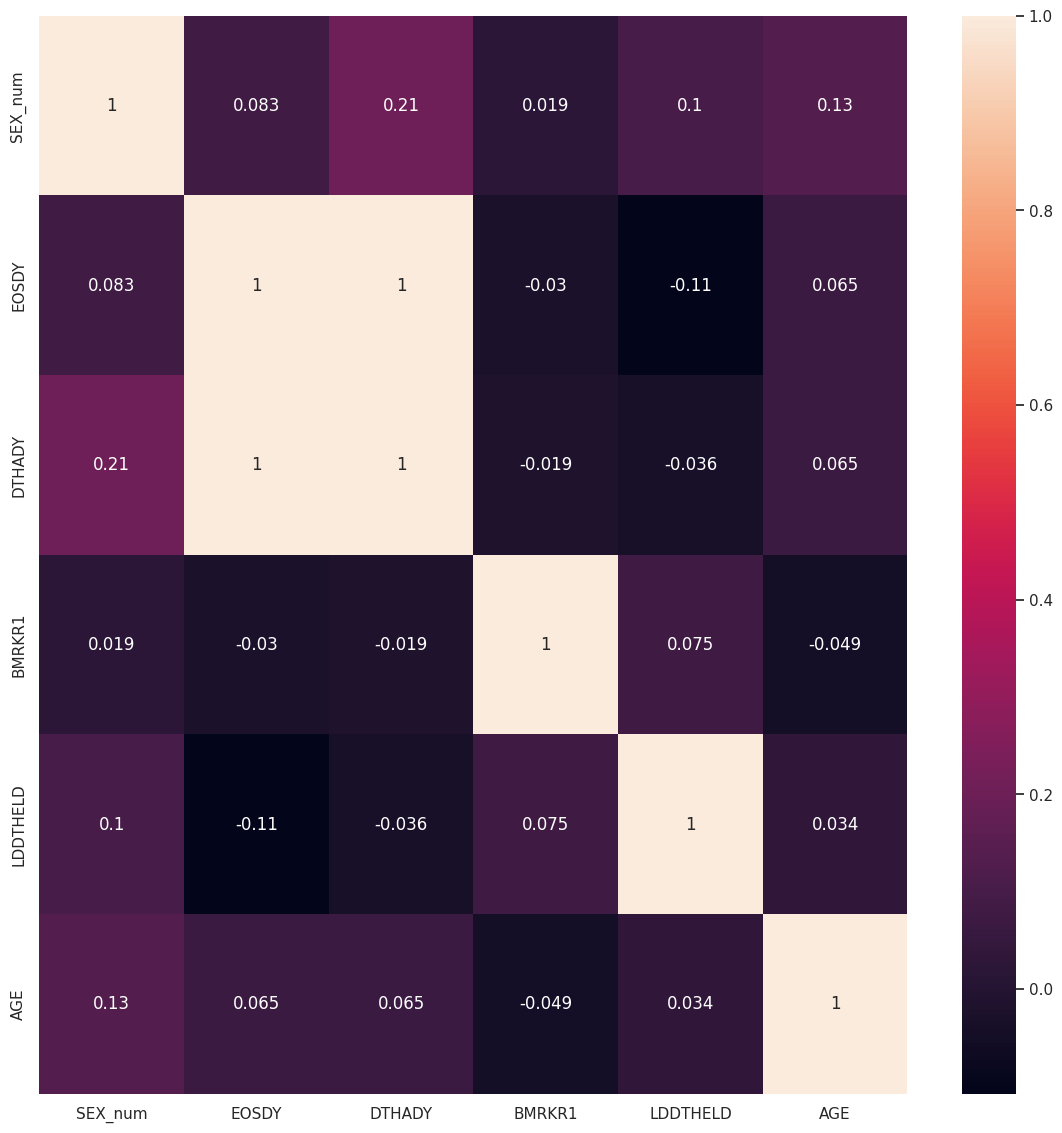
Plotting the relationship between some cloumns
You can plot the relationship between columns using the relation function. It will return one or two heatmaps depending on the input. For categorical data, it will plot a heatmap of chi-square values. For numerical data, it will show the correlation.
Here, we have removed columns with too many null values and have used the data-selection function to select some columns to plot and then plotted the relationship heatmaps.
# removing all columns with too many null values
for null in too_null_1[0]:
    dm_no_too_null = dm_uncleaned.drop(null[0], axis=1)

# choosing columns to plot
dm_no_too_null = da.data_selection(keep_col=["STRATA1", "ARMCD", "STRATA2", "SEX_num", "EOSDY",
                                             "REGION1", "ACTARM", "DCSREAS", "DTHADY", "BMRKR1",
                                             "DTHDT", "DTHFL", "SEX", "COUNTRY", "LDDTHELD",
                                             "ETHNIC", "DTHCAT", "DTHCAUS", "AGE"],
                                              input_data=dm_no_too_null)
# drawing the relationship plot
vis.relation(dm_no_too_null, path='.')
[[<Figure size 1400x1400 with 2 Axes>, <AxesSubplot:>], <AxesSubplot:>]